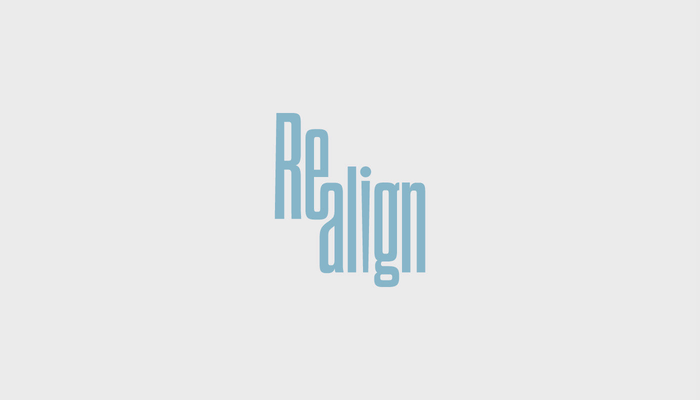
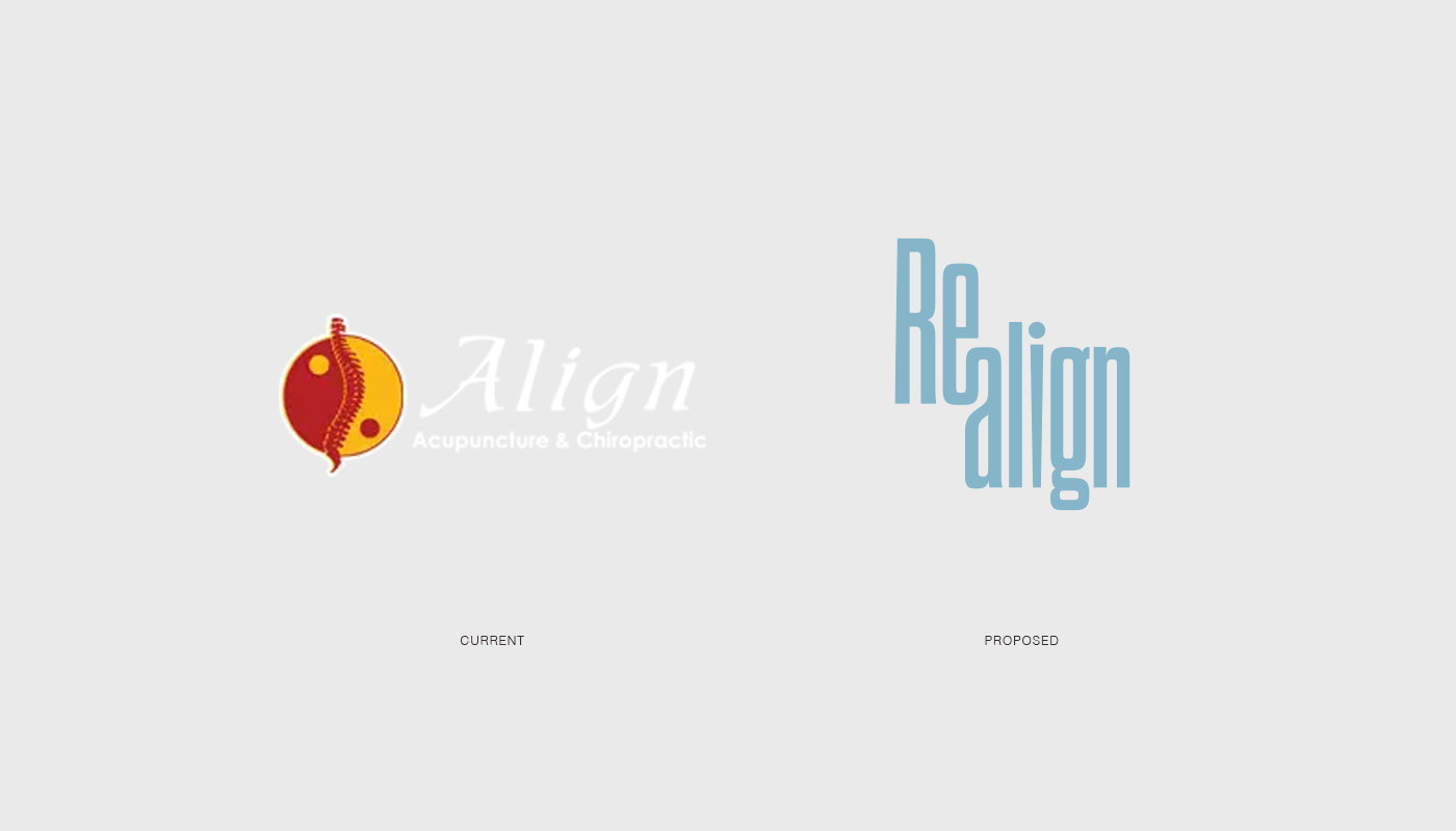
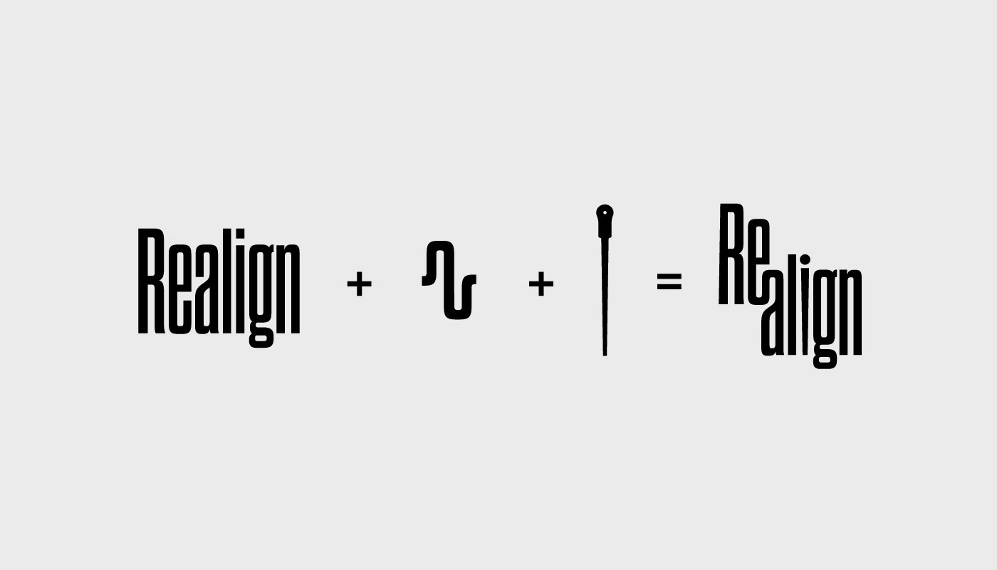
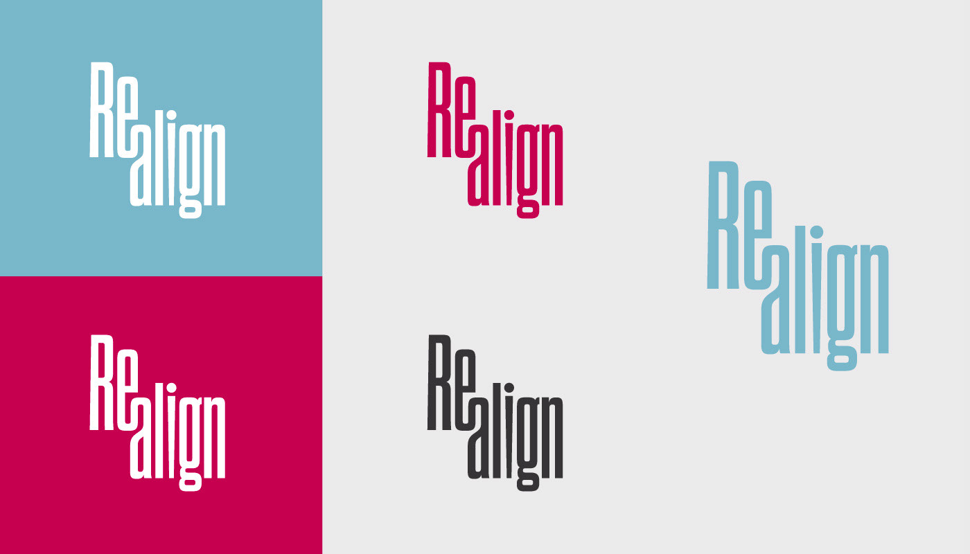
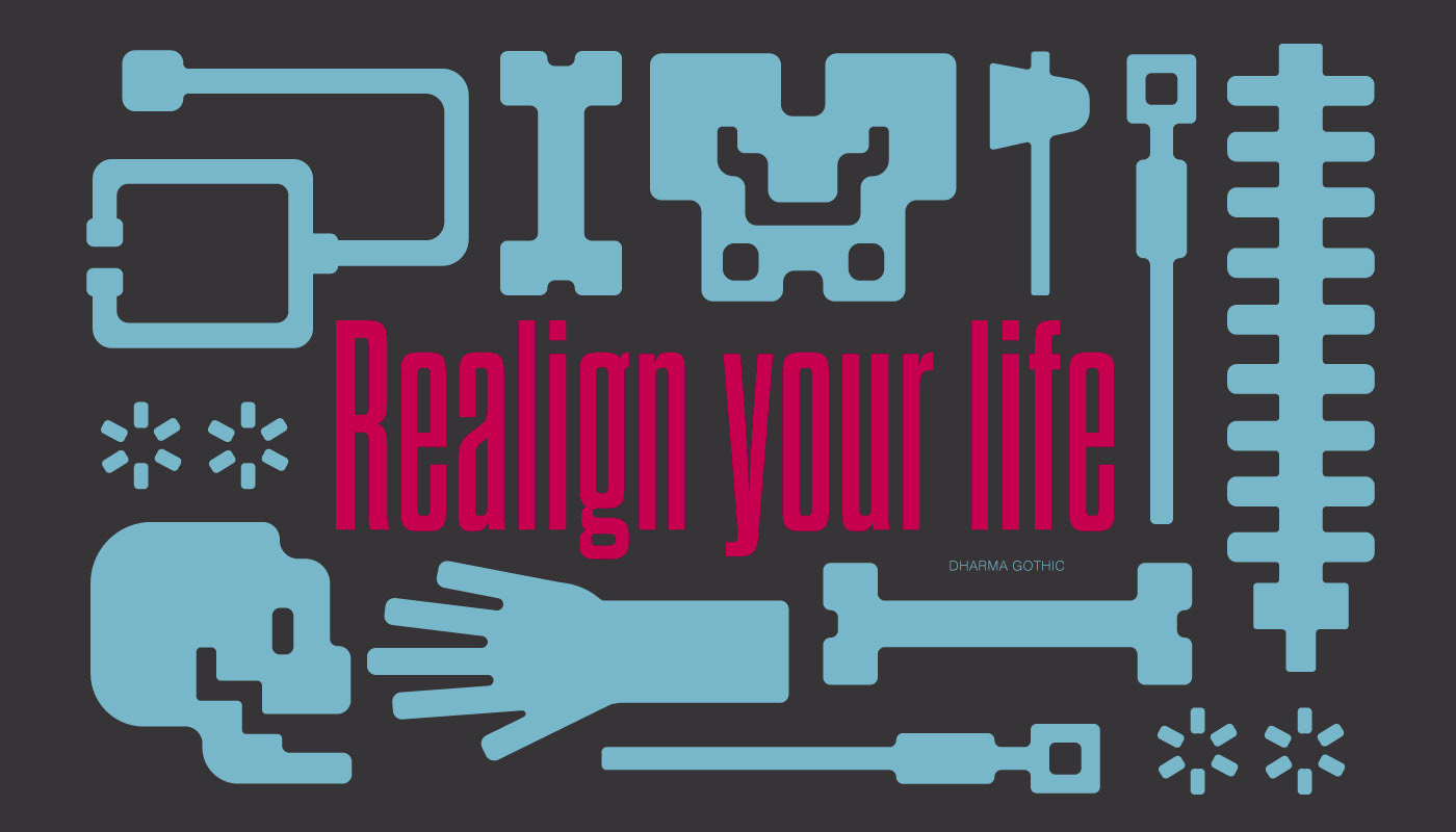
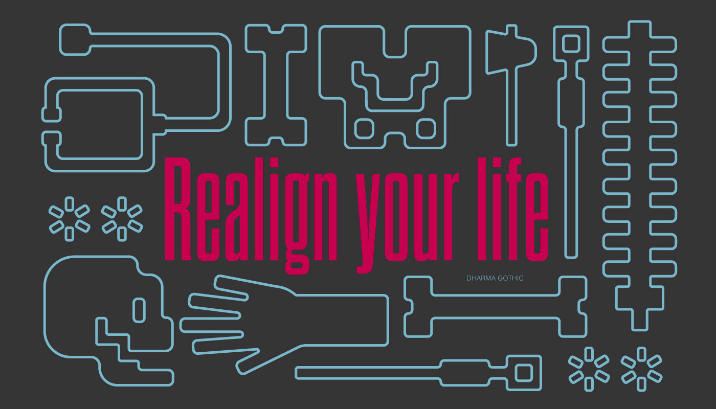
The redesign of Realign was intended to give a fresh new look to a chiropractic and acupuncture clinic while staying professorial. Inspired by the daily tools within the field, Realign reimagined the mundane bones and needles of a typical clinic. The wordmark physically is realigning the clinic's name to resemble the realigning of bones and joints that is practiced by chiropractors. The “i” within the clinic’s name is represented by a simple rendition of an acupuncture needle that is used by these professionals. The color palette was directly inspired by full-colored x-rays.
The proposed logo was successful in creating a unique word mark by utilizing the common movements and elements within both professions the clinic offers. The color palette is successful in creating a refreshing and welcoming feel for the clinic that most might find daunting.
Recognition:
Graphis New Talent 2023, Honorable Mention, Logo Design
Graphis New Talent 2023, Honorable Mention, Logo Design